The Problem with Collagraphs
The problem with collagraphs is that most people actually don’t know how to make a good one.
A lot of people don’t really even know how to make one themselves, but nevertheless think they know about them.

Do you know how these collagraphs were made?
Collagraphs have a terrible reputation among ‘serious’ art-world types. I get it, of course.
As a very entry-level friendly technique, a lot of novices are instructed in the method. Of course, they then make novice, entry-level artwork. The more ‘serious’ types then are accustomed to associating collagraphs with entry-level, novice work, and dismiss the technique in general.
You can see the type of novice work I mean here–cardboard plates, dry foodstuffs, wet sketchbook paper, using paint in the place of inks, and no press. Like I said, I understand the negative bias. Unfortunately, it interferes with people’s perception of well-executed collagraphs.
[The woman in the linked video seems perfectly nice and I mean no disrespect to her personally; I just selected the video because it contains all the stereotypes of what people think they know about collagraphs, which is to say that many people think all collagraphs are made like that.]
[EDIT: to see a more recent post in which I illustrate the printing of a collagraph, go here.]
I encountered this negative bias recently in two interactions–one was at the Ink fair during Art Basel Miami Beach, when (I wont mention who!) an exhibitor (and publisher) of works that were clearly collagraphs used a different term to describe them. The works were made by mixing carborundum grit with a glue, applying it to different plexi matrices, inking it as an intaglio and printing the plates in register in order to edition them.
Obviously, it’s a complicated and sophisticated process. Also obviously, it’s definitely a colla-something process. We chatted a bit, and the exhibitor fessed up that his avoidance of the term collagraph was to avoid negative connotations.
The second place I encountered the prejudice against collagraphs was during the jury process at the school where I teach.
During a discussion of one of my student’s works, a fellow jurist had a positive response to one of the prints until learning that it was a collagraph. It might be that this jurist’s opinion of the work didn’t change, but I saw a slight disdain come over the jurist’s visage as soon as the word “collagraph” came up: “oh, that stuff with the cardboard”.
I demonstrate and instruct collagraph a lot. Sometimes I use cardboard.
Usually, however, I use chipboard (the difference between chipboard and cardboard is that cardboard is hollow, with supporting interior ribs, which means it squishes in the press and prints with a regular linear pattern). Nitpicky, yes, but it makes a difference.
One major positive of collagraph is that it’s an inexpensive technique. A second major positive is that it’s flexible–you can print is as either relief or intaglio. It also doesn’t require specialized tools (beyond the inks, press and press equipment, of course).
I adore copperplate intaglio, but copper is very expensive, and students are reluctant to purchase it (they usually don’t understand that copper plates are re-usable, in part because they become so attached to the plate), while chipboard (not cardboard!) only costs a few dollars for a fairly large sheet. So you can buy it by the sheet—or just use the back of a newsprint pad!
Those hard ‘cardboard’ backs of sketchbook pads? Chipboard.
You can use collagraph to familiarize students with mixing and rolling out inks, ink properties, use of the press, intaglio inking, use of tarlatans, hand-wiping and editioning.
It is an entry-level friendly method! Just because it is one, though, doesn’t mean all work produced with it is low quality.

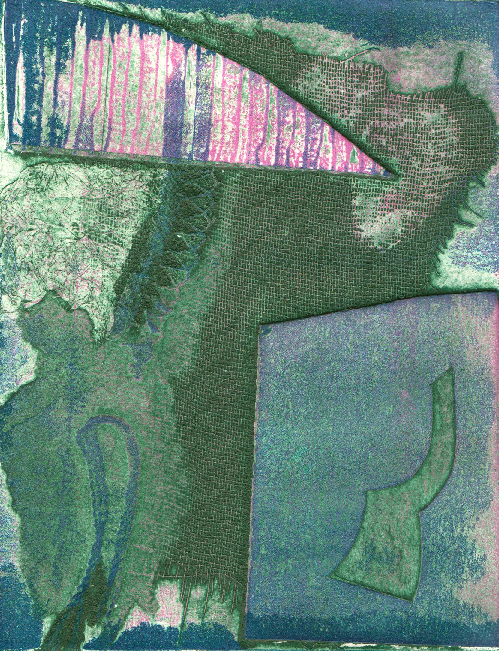
The print above is a collagraph from a plate I made as a demo for a high school-age weekend workshop for Young Arts.
It’s the usual glue-bits-of-crap-together plate, the type which is almost impossible to avoid when you build a plate live for instructional purposes. Students need to be able to see you create the damn thing on the spot, and you usually only have a few hours with them, so scraps and crap it is!
This one is built on chipboard, with more chipboard, some cardboard, lace, yarn, paper, tin foil and tarlatan.
This particular impression has been relief viscosity rolled in two colors.
Viscosity inking techniques use the relative viscosity of separate inks to determine how they will be applied to the plate–the texture of the plate, the durometer (softness or hardness) of the brayer or roller, the height of the plate elements, and the order and direction in which the inks were applied–the different colors are all applied before the plate is run through the press, meaning it prints in one run–determine how the inks are laid down and the degree to which they blend.
The white halos around plate elements are an indicator that the above image was inked as a relief plate; where substantial height difference exists between plate elements, the roller, or brayer, will not be able to force ink into that area.

Obviously, the above image is of the same plate. Hopefully, you can see a gigantic difference between the two!
This impression has been inked intaglio-style in green before being rolled as a relief plate with two colors using the viscosity inking methodology. It was printed on a high-quality, damp alpha-cellulose intaglio paper at significant pressure.
The white halos are gone (replaced by the green outlining from the intaglio inking), the texture of all elements is dramatically more impressive (ha!), and overall, the image is just better. The image doesn’t mean anything, but it’s pretty, and rather intoxicating to hold in your hand because of the color and textural richness.
With the right knowledge and technique, you can glue dried spaghetti on a flattened cereal box and pull an interesting print.

I didn’t have any dried spaghetti at the time I made the plate for this demo, sadly. Only the usual chipboard, cotton rags, and tin foil. I did use a flattened box, though!

This plate was sealed with gesso (which I don’t recommend–it absorbs too much ink for the first few impressions) before it was printed. This was also made as a demonstration for a high school printmaking class at NWSA.
I won’t make a case for these prints as art, but I assure you that they are good impressions.
That’s kind of a weird thing, right? Most artists won’t make claims as to what is or is not art–at the most, folks’ll say what is or is not good art, and a lot of times they don’t have many believable reasons as to why.
One of my theories is that the inherent skill with which a work was produced acts upon the viewer as a signifier that something is Good Art.
Skill comes through study, time, and dedication–all of which are hard to avoid as a professional artist. At the student or novice level, however, those aspects aren’t necessarily in place yet, and so skill can be hit or miss. Like anything else, the student (or novice!) who works hard and strives to achieve can ‘hit’ more often than not.

This student (who I’ll identify if she wants me to!) used tulle, paper, lace and an X-acto incising technique before coating the plate with acrylic gloss gel medium with a brush. It’s simple platework, well-inked and well printed, on good paper. No dried foodstuffs. Edition of 7.
There’s an odd grey area in collagraph–what do you call a chipboard plate that’s been coated with acrylic gloss gel medium, but hasn’t actually had anything glued to it?
I’ve been calling it chipboard relief.

The print above was printed in an edition of 6, and is intaglio wiped (the lines of the wood are cut out from the chipboard plate–incised) with a finishing relief roll printed on intaglio paper. It’s put through the press once per impression.
Really, though? To be honest, the only thing that makes the platework different from the other prints illustrating this post is that I didn’t glue anything to the plate. In my student’s work above, she didn’t technically glue anything either–she did use the gloss gel medium as a glue, however. Acrylic gloss gel medium is a fancy glue!
I could call it intaglio, perhaps–like copperplate intaglio. We don’t usually say zinc intaglio, but we do say drypoint on plexi. We do say mezzotint. Though I did learn a collagraph technique which approximates mezzotint. I could simply call it relief, I guess; wood and chipboard both come from trees, after all. Wait–isn’t plywood made of wood which is glued together in thin layers? So a carved plywood sheet might be able to be called a collagraph!
You begin to see the conundrum here. I can call it lots of things, but most of those things I call it won’t mean anything to anyone except printmakers. So why not call it a collagraph?
I personally haven’t been doing so because I’ve been being technically pedantic! But that’s just me.
So here’s what I think. Unless you’ve personally created a good quality collagraph, don’t get snooty about the technique (and if you have created a good quality collagraph, you won’t be snooty about the technique because you’d understand how tricky it can be!). Judge the artwork, fine–I have no problems with that!
After all, there’s many a novice cook (or poet, or singer) out there with lackluster offerings, but we don’t look down upon food (or poetry, or music).
Even a good cook will use dried spaghetti and be found with a cereal box in hand from time to time.
One more thing: people are generally not printing collagraphs by hand because they prefer it–rather it’s because they don’t have a press. Very few techniques are able to be adequately printed by hand; relief is pretty much the only one, and even then, pulling a good print by hand is not easy. So if there’s a press nearby, don’t suggest that someone print a collagraph by hand.
I guess if you don’t like that person and want to cackle madly while they laboriously develop tendonitis from hand-impressing their plate, then maybe.
Otherwise, no.